Running your toolkit
Analytics and engagement
See how your team uses each part of the toolkit, to guide training and content, not to measure individual performance.
- Practice admins
The toolkit records when staff open symptoms, handbook pages and workflows. Practice admins can see these figures in two places: Analytics in Practice settings gives a short summary across modules, and the Engagement tab in Signposting settings goes into detail on symptom use.
Both are there to answer practical questions: is the toolkit being used, which content matters most, which content isn’t being found, and who might need a hand getting started. They are not designed to monitor individual performance, and the Analytics page says so at the top.
Standard users can’t see either page. Superusers can see them for any practice; the Signposting Toolkit team’s cross-practice views are not covered here.
Analytics
☰ MenuPractice settingsAnalyticsThe page shows a summary card for each module your practice has, how staff rated the toolkit if your practice takes part in feedback surveys, then a list of staff activity.
Module summaries
Each card shows three figures and the top five items:
| Card | Figures | Top list |
|---|---|---|
| Signposting Toolkit | Symptom views in the last 7 days and the last 30 days, and the number of staff who viewed symptoms in the last 30 days | Most used symptoms |
| Practice Handbook | Handbook page views in the last 7 and 30 days, and staff engaged in the last 30 days | Most viewed pages |
| Workflow Guidance | Workflow views in the last 7 and 30 days, and staff engaged in the last 30 days | Most viewed workflows |
The top lists cover the last 30 days. The handbook and workflow cards appear only if your practice has those modules, and each has a View detailed engagement link to that module’s own engagement page. The Signposting card links back to the symptom directory; for symptom detail, use the Engagement tab.
Staff feedback
If your practice takes part in feedback surveys, Staff feedback shows how your staff rated the toolkit when asked How useful is the toolkit in your day-to-day work?:
- the share who chose Very useful or Extremely useful, with the numbers it comes from, such as “18 of 20 ratings”
- how many chose each of the five answers
- how many said I haven’t used it enough yet, which isn’t a rating, so it isn’t counted in the share
The share is of the staff who gave a rating, not of all your staff. Every rating counts, with or without a comment, whether the card asked them or they chose to answer from the menu.
To protect the people who answer:
- Results appear once at least five staff have given a rating. Until then the section says there aren’t enough yet, without saying how many there are.
- With fewer than ten ratings, results are marked Small sample: one person’s answer moves the share a long way.
- The figures change once a week, on Monday. They include ratings given up to the end of the Saturday before: staff can change a rating for a day after giving it, so Sunday’s ratings wait a week. That way the figures never move during the week, and a new rating, or a change to one, can’t be picked out.
- You never see comments, names, or who answered, was asked or chose not to. Only the Signposting Toolkit team reads comments.
Copy summary copies the headline as a sentence for a report or newsletter, for example: “90% of staff who gave a rating at your practice found the toolkit very or extremely useful — 18 of 20 ratings, October 2026.” It isn’t offered below five ratings.
What staff see when they’re asked is in Answer a feedback survey.
Usage by staff
Usage by staff lists the team members who have used the toolkit in the last 30 days. For each person it shows:
- Staff member: name and email
- Modules accessed: a tick for each module they’ve opened (Signposting, Handbook, Workflow)
- Last active: when they last opened a card, Handbook page or workflow
Use it to spot people who haven’t started yet, or a module the team isn’t using, so you can plan training or a reminder. Someone missing from the list may be using the shared practice login, whose activity can’t be linked to a person.
Clinical review and admin work don’t count here, so a reviewer can be busy without appearing. To see when someone last used the toolkit for anything, see Users & access.
The Engagement tab
☰ MenuSignposting settingsEngagement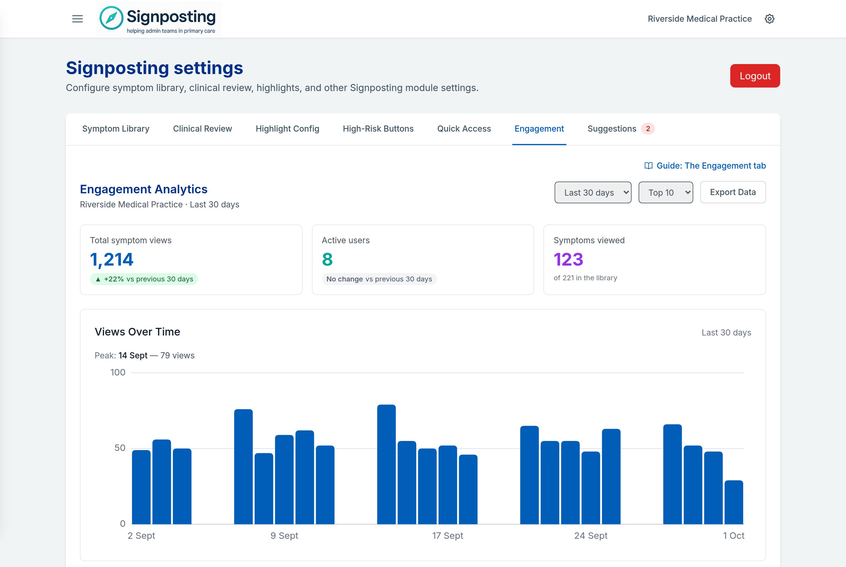
A line under the heading says what you’re looking at: the practice and the date range.
Choose the date range (Last 7 days, Last 30 days, Last 90 days or All time) and how many items to rank (Top 5, Top 10 or Top 20).
Summary tiles
The tiles show totals for the range: Total symptom views, Active users and Symptoms viewed, each with the percentage change against the previous period of the same length.
Views Over Time
Views Over Time plots symptom views per day, with the peak day named above the chart. Move across the bars to see each day’s figure. On All time, the chart shows the most recent 90 days.
Most viewed and most active
Most Viewed Symptoms and Most Active Users rank the top items for the range, with bars showing relative volume.
Least Viewed Symptoms
Least Viewed Symptoms shows content that isn’t being used, and how many symptoms had no views at all. Use it to pick symptoms to cover in training, or to ask whether a card is still needed. Views are recorded for library symptoms only, so symptoms your practice created itself aren’t included.
Busiest Days & Times
Busiest Days & Times shows when staff look things up, by day of the week and hour of the day, in UK time. The busiest hour is named under the chart. It can help with staffing and with choosing times for training.
Export Data
Export Data downloads what’s currently shown (the totals, the top lists, least viewed symptoms and the daily trend) as a CSV file. Choose Export CSV to confirm.
What the figures count
- Ranges are whole days in UK time. “Last 7 days” is today plus the six days before it, so the first bar is a complete day. Everyone looking at the same range sees the same window.
- The percentage change compares like with like. It uses the same stretch of time one period earlier, cut off at the same time of day, including across the clock changes. Today counts in the figures but doesn’t make the comparison look worse than it is. On Last 7 days the comparison covers exactly the same weekdays; on 30 and 90 days the mix of weekdays and weekends can differ slightly, which can move a small change by a few percent either way.
- Clinical review is left out. Opening a symptom from the Clinical Review tab is content checking, not signposting, so it isn’t counted as a view. Nor is opening one while triaging a suggestion.
- Active users counts only views linked to a person. A view is linked when someone is signed in with their own account; views from a shared practice login can’t be. Where the two differ, the tile says how many of the period’s views were signed in, so you can see how much of the traffic the user figure represents.
- Symptoms viewed counts symptoms in your library today, and shows the library total beside it. It equals the total in Least Viewed Symptoms minus those never viewed, so the two cards agree. Retired symptoms are left out of both.
Module engagement pages
The Practice Handbook and Workflow Guidance each have their own engagement page with more detail: see Practice Handbook and Workflows. Setup progress and a 30-day usage summary also appear on Surgery Health.